The brand new eZ Studio
In December 2015 eZ presented eZ Studio, a brand new and modern software tool for the popular CMS eZ Platform. We have already taken a closer look at what the next generation of content editing will look like.
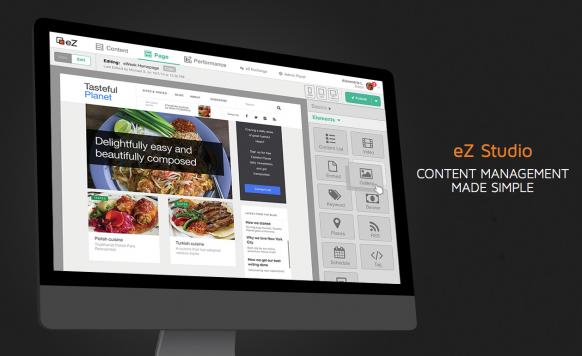
From a design point of view this is a major upgrade from their previous versions. It has many modern features like drag and drop, real-time previews for multiple devices, a new way to interact with time-scheduled content via an intuitive timeline and more. But in my opinion the most important fact, besides all these new fancy features, is that the content itself is the main focus of the whole interface.
The content creator
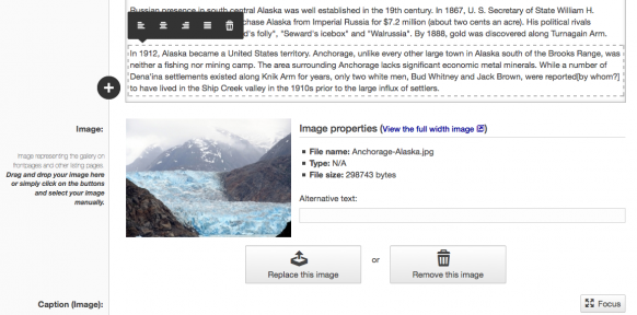
The interface looks pretty modern. With the main content in the middle, all available tools are inline and easy to reach. At first the concept of inline tools may be confusing, because at a first glance it seems as though there are no formatting options available. But as soon as you click into the content area the tools available for this particular type of content are shown. In traditional text editors or word processors you may find all the available editing options over the editing area. Which easily distracts from the content itself. With the new inline-tools approach the user can focus on the content first. eZ Studio interface is doing just that, most options regarding the editing areas are hidden at first and only show up as an inline menu at a click of a mouse. Once you’ve adjusted to this new interface it is very nice and comfortable.
Different previews
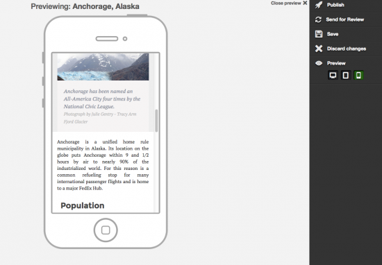
The modern web is not just for the desktop computer anymore. Even though you may produce most of the content on a desktop device, the information is consumed on a wide range of devices like smartphones and tablets. eZ Studio handles this very well by directly offering three types of preview for your content. This way you can quickly see how your content will look like in those types of devices.
Edit content inline
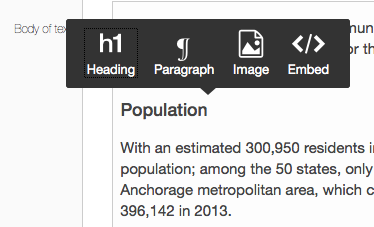
This is actually a radical change from previous versions and also from other CMS where you get the classic HTML editor with all the editing options visible. This new approach is minimalistic. Less is more. You get only a few format elements, and if you need more you just can click on + and start adding elements. At first you may miss having all the usual buttons at glance, but how many of those buttons of your HTML editor do you really use regularly?
The page viewer/editor
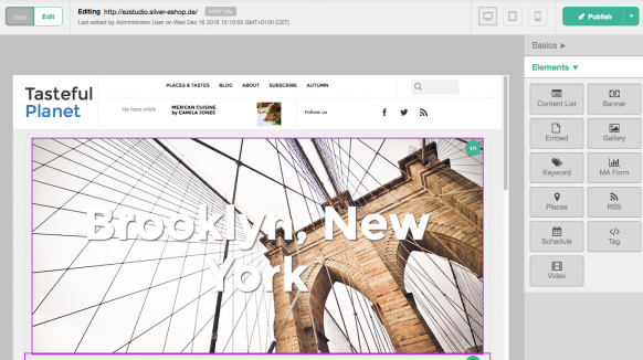
The first thing that becomes apparent is that view and edit functionality are on the same page. This is quite nice because as a content editor you are able to see the full picture in the same place where you are creating and playing around with different content.
The landing page editor is also presented as a preview with all elements with a menu available for drag and drop. You can rearrange, preview and delete elements right there. Unfortunately they did not yet add an edit button. To edit a single content element from this interface you should switch back to view mode, then click on the element and then finally click edit again. Or of course you can switch back to the content editor and search for the document there, but then you will not be using this nice view/edit way of working with your content. For sure this minor annoyance will be fixed/added in future versions.
Also very handy is the preview in different devices, which is also available in this section, and will give you an impression of how the landing page will look on desktop, tablet and smartphone. This page viewer/editor has the same philosophy regarding content – content takes center stage.
Schedule blocks
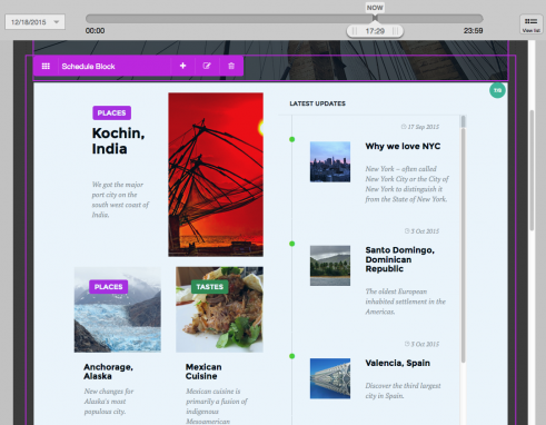
A major change has been brought to scheduled content. This functionality is not new. It has been available with the eZ Flow module for quite some time now. But where the eZ Flow user interface has been a bit cryptic at times this completely new interface is very transparent and user friendly. Editors are now able to preview and edit content by using a timeline that appears on top. It is looking very good and the fact that you can see and edit content for certain points in time is quite practical.
Finally…
With this kind of interface eZ platform is taking a big step ahead of other CMS software solutions, both enterprise or small scale, which don’t have this kind of user experience that puts full focus on the content itself.
Happy content writing!


